Tips · Guide
Menu design tips for cafés and restaurants: one page, fewer questions
Most bad menus are a list problem before they are a layout problem. How we cut, order, price and test a one-page menu so the counter gets fewer questions.
A menu sells more than anyone on your payroll, and it never asks for a day off. These menu design tips come from the way we plan menus for cafés and restaurants, and most of them happen before anyone opens a design file. A bad menu is usually a list problem first. The layout only makes it visible.
Everything below is the studio's view. The package details near the end come from our own package pages.
Menu design tips that start with the list
Cut before you design
Print the full list of dishes and drinks. Put a line through anything that sells slowly, slows the kitchen on a busy night or exists because one regular asked for it once. A long menu reads as a kitchen that hasn't decided what it's good at.
Group in the order people order
Sections should follow the meal, or the queue. For a café that usually means hot drinks, cold drinks, then food. For a restaurant, starters, mains and dessert. Five clear sections read faster than eleven clever ones.
Give each section one lead
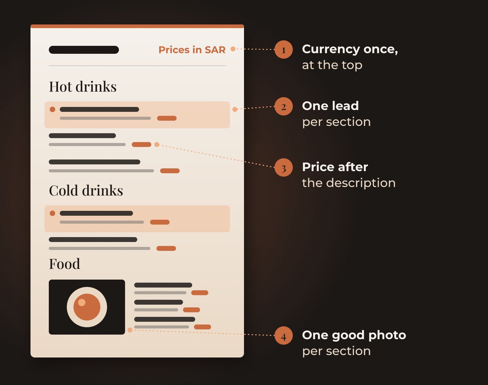
Pick one item per section to point at, with a small mark, a tinted panel or an extra line of description. Mark every item and the marks cancel each other out.
Write descriptions people can picture
Two lines at most. Ingredients and one honest adjective. "Slow-roasted lamb, saffron rice, toasted almonds" does the job. "An unforgettable journey of taste" tells the reader nothing, and they know it.
Prices, photos and the small print
Set each price straight after the description, in the same type size, instead of lining every price up in a column on the right. In our view a neat column of numbers invites people to shop by price and read the dishes second. Put the currency once, at the top, with a single line such as "Prices in SAR". Repeating it on every line costs space and adds noise.
One good photo per section beats a grid of twelve average ones. Images are provided by you in our F&B packages, so shoot fewer dishes properly, in daylight, instead of all of them on a phone under kitchen lights.
Prices change. Plan for it on day one. Ask for editable source files, so a new price is a short edit instead of a redesign. Our F&B Full Identity package delivers JPEG, PDF and AI files for exactly this reason.
Two languages on one page
A bilingual menu carries two scripts, and the layout you choose decides everything after it. Side by side works when names are short, with Arabic on the right and English on the left, sharing one line per item. Stacked, with one language above the other, suits longer descriptions. Two sides of the card suit long menus. Whichever you choose, use it on every page and every printed size. Pairing the type is its own job, and our Arabic font pairing guide includes a menu test built for exactly this.
Four tests before it goes to print
Test 1: The dim light test
Read the final proof at a table in the evening, under your actual lighting.
It passes if: Every price is readable without a phone torch.
Test 2: The arm's length test
Hold the menu at arm's length and look for the sections.
It passes if: Each section heading stands out at a glance.
Test 3: The two-script test
Read the Arabic on its own, then the English on its own.
It passes if: Each one makes sense without the other, with nothing missing.
Test 4: The price change test
Ask how long it takes to update one price and reprint.
It passes if: A short edit to the source file. No redesign.
If your takeaway packaging comes next, our F&B packaging checklist covers what to settle before that design starts.
Questions people ask
What makes a good café or restaurant menu design?
A short list, sections in the order people order, one lead item per section, descriptions people can picture and prices that are easy to find without being the loudest thing on the page.
Should a bilingual menu put Arabic or English first?
Decide by your customers and your brand's lead language, then keep the same order on every page and size. In a side-by-side layout, Arabic sits on the right and English on the left, following the direction each script reads.
How many items should a menu have?
In the studio's view, as few as your kitchen can make well on its busiest night. If the list needs more than one page, that is usually a sign to cut before you design.
Fewer dishes, clearer prices, one page. The kitchen will thank you.
The Brandtastic team
Written by Brandtastic Design Studio.