Guides · Guide
Arabic font pairing: matching Arabic and English type without a fight
Most bilingual brands pick a lovely English typeface and let the Arabic fend for itself. Five steps and four tests to make the two scripts sound like one voice.
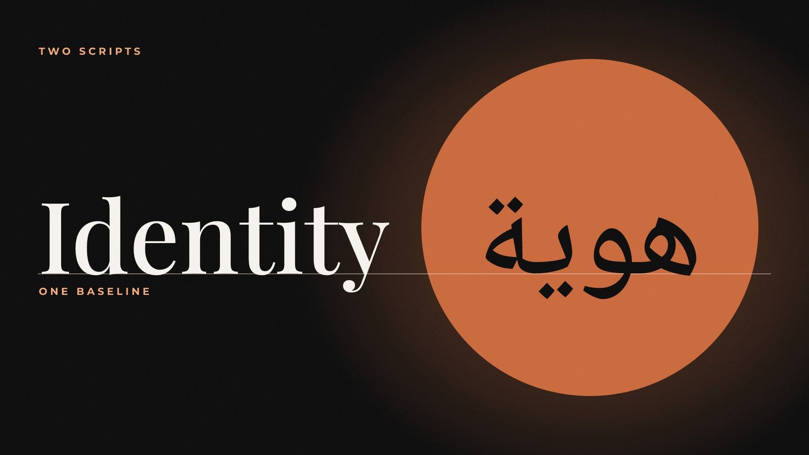
Arabic font pairing is where a lot of bilingual brands quietly come apart. The English side gets a carefully chosen typeface. The Arabic side gets whatever came with the laptop. Put them on the same business card and they look like two strangers sharing a lift, polite and visibly uncomfortable.
A good pair reads as one voice speaking two languages. You get there by matching structure first, weight second and size last, then testing the pair on real material before it goes anywhere near a printer. Here is the method we use.
Arabic font pairing starts with structure
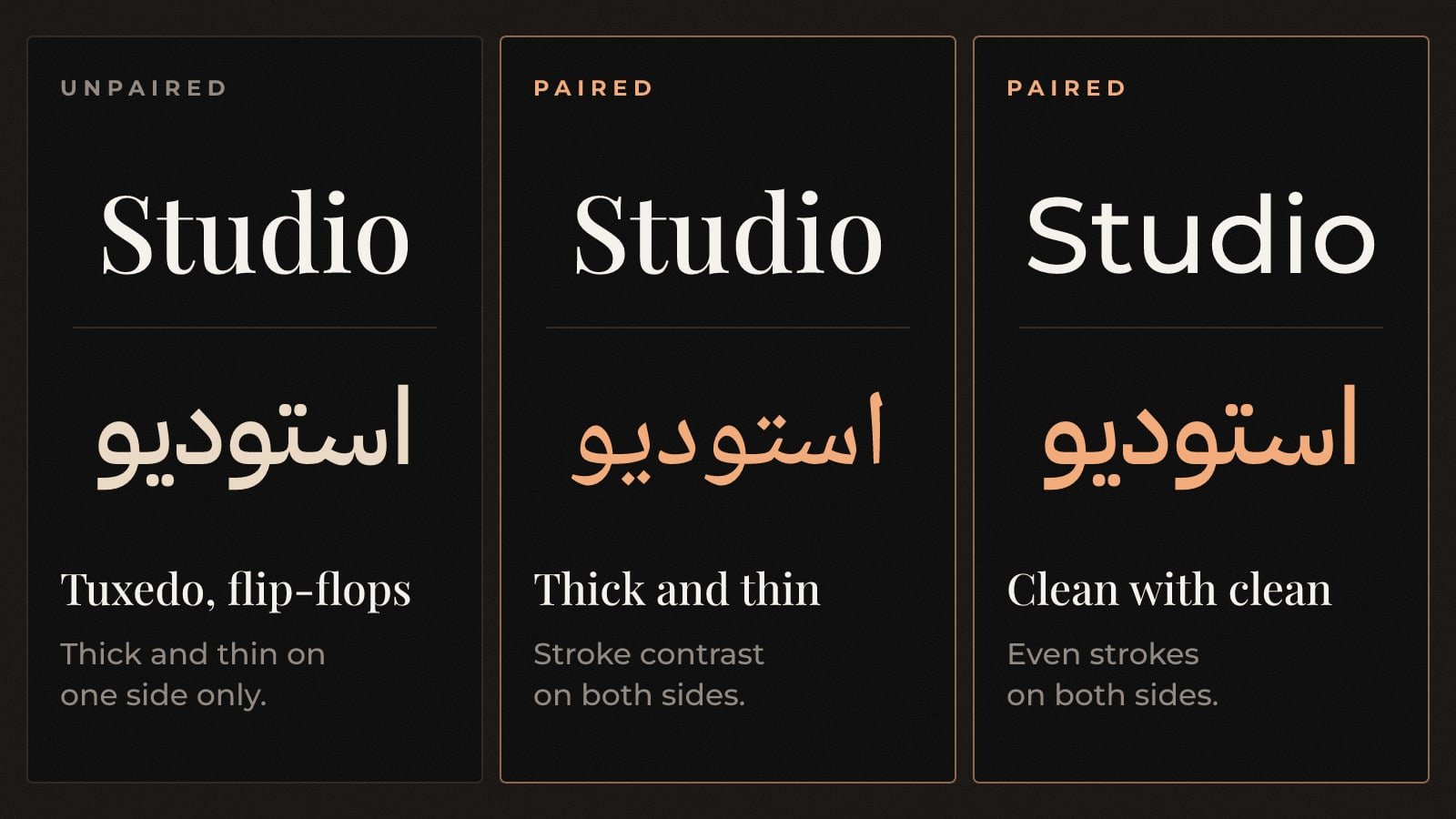
Latin type is mostly separate letters standing on a baseline. Arabic is a connected script, written right to left, with letters that change shape depending on where they sit in a word. Hunting for lookalike letters gets you nowhere. Look for a shared attitude instead. Geometric goes with geometric. Humanist goes with an Arabic face that keeps a trace of the pen. A high-contrast serif needs an Arabic partner with real thick and thin strokes, or the pair will feel like a tuxedo with flip-flops.
Pick the lead script
Decide which language carries the brand in your main market. For a business selling mostly in Saudi Arabia, that is usually Arabic, so we tend to choose the Arabic face first and find the Latin partner second. Done the other way round, the Arabic often ends up looking like a translation.
Match the skeleton
Compare stroke contrast, the ends of strokes and the overall rhythm of a line. Ignore individual letters, since no Arabic letter has a Latin twin.
Match the weight
Set a paragraph in each script at the same point size and the same named weight. Then squint. One will almost always look darker. Move one side up or down a weight until the two blocks of text turn the same shade of grey.
Match the size
Arabic letters sit at different heights from Latin ones, so equal point sizes rarely look equal. Scale one script until both read at the same visual size, and write that ratio into your guidelines so nobody has to guess later.
Check the family and the licence
Make sure both typefaces come in the weights you will actually use, from body copy to bold headlines, and that the licence covers print, web and apps. A family that stops at Regular runs out of road the first time you need a bold price tag.
Four tests before the pair ships
Test 1: The menu test
Set a real menu, price list or product label in both languages, side by side.
It passes if: Neither column looks heavier, more cramped or louder than the other.
Test 2: The small-size test
Print a business card and a social caption at actual size.
It passes if: Arabic dots and small letters stay crisp at the smallest size you will ever use.
Test 3: The mixed-line test
Write an Arabic sentence with an English brand name dropped into the middle of it.
It passes if: The English word sits in the line comfortably, with no jump in height or darkness.
Test 4: The numbers test
Set prices, dates and phone numbers in the numerals your customers actually read.
It passes if: Digits line up and look like they belong to the same family as the letters around them.
If your logo already has an Arabic and English lockup, the brand typefaces should respect it without copying it. Our bilingual logo design guide covers how we balance the two scripts inside the mark. The typefaces then carry that balance into everything else, and the brand guidelines tell your team exactly how to use them.
Common Arabic font pairing mistakes
Do
- Choose both typefaces at the same sitting, side by side on one screen.
- Write the size ratio and the matching weights into your guidelines.
- Check the licence for every place the fonts will appear.
- Test on the smallest thing you print, usually a business card or a label.
Don't
- Pair a free system Arabic with a carefully chosen English face and hope nobody notices.
- Stretch, squash or fake-bold Arabic letters to make a line fit.
- Pair two decorative faces. One personality per brand is plenty.
- Leave the pairing decision to whoever designs the next flyer.
Questions people ask
Should Arabic and English fonts come from the same type family?
It helps when one well-made family covers both scripts, because the weights were drawn to work together. Two separate typefaces can also pair well, as long as structure, weight and visual size are matched and tested on real material.
What size should Arabic text be next to English text?
There is no single ratio, because every typeface is drawn at a different scale. Set both at the same point size, compare them, then adjust one until they read equally. Record the result in your brand guidelines.
Can I use a free Arabic font for my brand?
Yes, if the licence allows commercial use in print, on the web and in apps, and the family has the weights you need. Read the licence before anything goes to print.
Two scripts, one voice. Squint until they agree.
The Brandtastic team
Written by Brandtastic Design Studio.