Guides · How-to
Designing a bilingual logo in Arabic and English
Two scripts, two directions, one brand. How to design an Arabic and English logo that looks like it was always meant to be together.
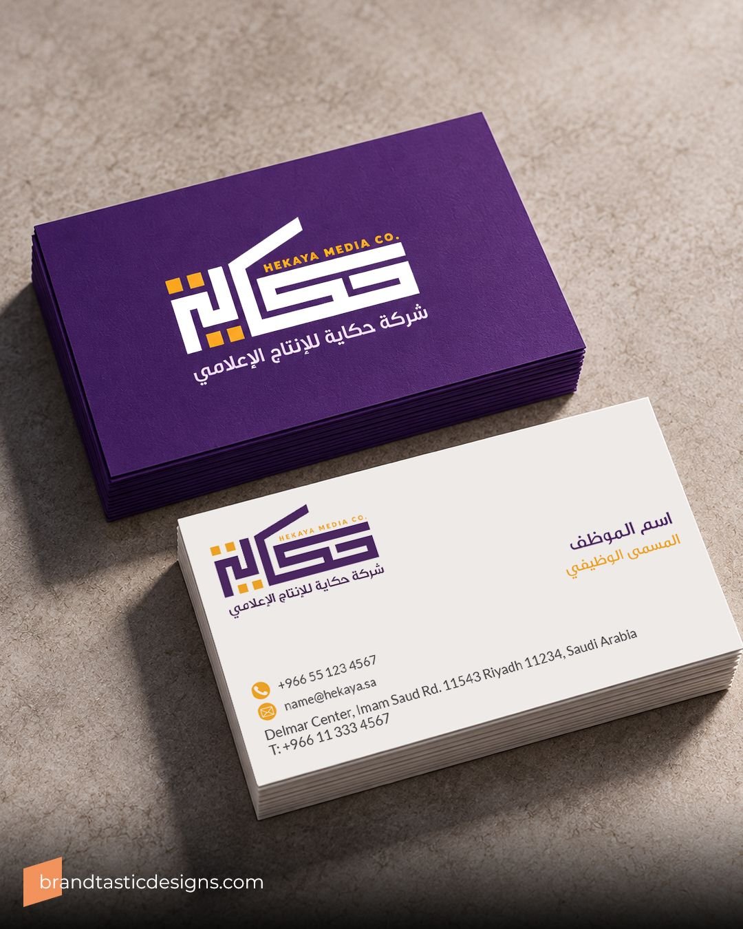
In the Gulf, most brands live in two scripts. The shop sign, the menu, the Instagram bio and the invoice often carry Arabic and English, and customers switch between them without thinking about it.
Designing for both is its own discipline. The two scripts follow different logic, and a logo that ignores this tends to look like two logos sharing a frame.
Know what you're working with
| Arabic | English (Latin) | |
|---|---|---|
| Direction | Right to left | Left to right |
| Letters | 28, most of them joined | 26, written separately |
| Letter shapes | Change with position in the word | Fixed, apart from capitals |
| Capitals | None | Upper and lower case |
These differences explain why translating the name and setting it in the nearest Arabic font rarely works. The weights won't match, the heights won't line up, and the Arabic often looks smaller at the same point size.
Five steps that hold it together
Decide the lead language
Pick which script leads based on your audience, then give the second one a clear role. Equal quality matters more than equal size.
Design both from the start
Sketch the Arabic and English side by side from the first concept. Retrofitting the second script at the end is where most mismatches begin.
Match weight, then height
Balance stroke thickness first. Then align by eye, usually matching the body of the Arabic to the English x-height, and ignore what the font size numbers say.
Plan the layouts
Prepare stacked and side-by-side versions. A sign over a door and a profile picture need different arrangements.
Test it in real places
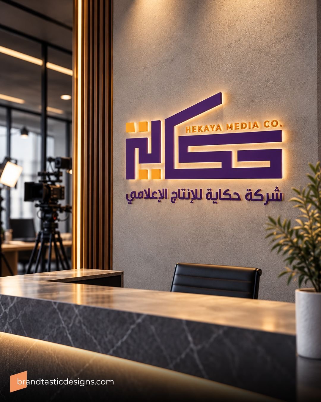
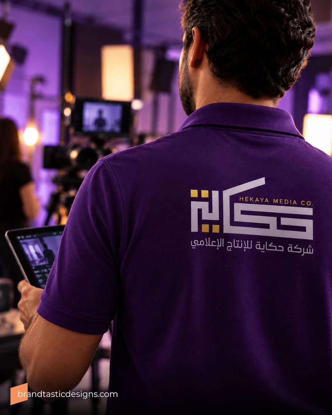
Check both scripts small, embroidered, in one colour and on a phone screen. Fine Arabic detail is usually the first thing to break.
Do and don't
Do
- Choose typefaces designed to pair, or customise one to match the other
- Keep the same spacing logic in both scripts
- Use one style of numerals consistently in a layout, Western (123) or Eastern Arabic (١٢٣)
- Have a native reader check every Arabic word before anything is printed
Don't
- Stretch or squash Arabic letters to fill a width
- Set the Arabic in a default system font beside a custom English wordmark
- Mirror an English layout and assume it reads correctly from right to left
- Trust machine translation with your name or tagline
Choosing typefaces for both scripts
Start with the job each typeface does. A headline face can carry personality. Body text has to stay readable on a phone screen and a printed menu. Some type families include Arabic and Latin designs drawn to work together, which saves a lot of manual matching. When the logo is custom lettering, the supporting typefaces only need to sit comfortably beside it.
Watch what each script does at small sizes. Arabic relies on dots to tell several letters apart, and those dots are the first details to disappear when a logo is shrunk, embroidered or printed on rough material.
Questions people ask
Should the Arabic or English logo lead?
Lead with the language most of your customers read first. In Saudi Arabia that is often Arabic, though brands aimed at international audiences sometimes lead with English. Either way, both versions deserve the same design quality.
Can I translate my English brand name into Arabic?
You can translate the meaning or transliterate the sound. Transliteration keeps the name recognisable in both scripts. Translation can break the link between them. Test both with real customers before deciding.
Which way do numbers read in Arabic text?
From left to right, even inside right-to-left Arabic text.
Sources
Written by Brandtastic Design Studio.