Tips · Guide
Instagram branding tips for GCC businesses: make the grid look like one company
Most small business feeds read like a history of the company, one mood at a time. Six decisions that make an Instagram grid look like one brand, and three tests to run before you post.
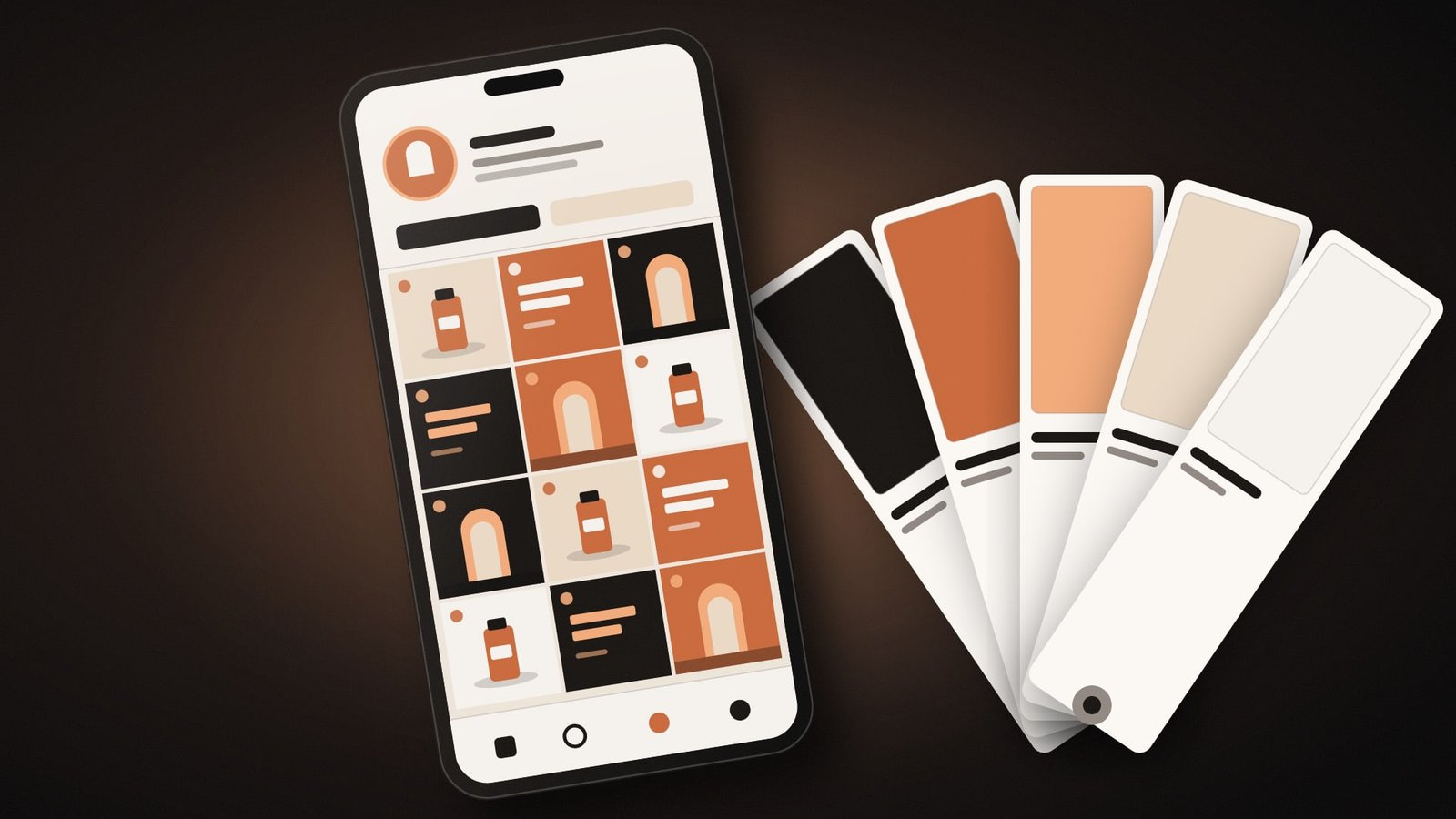
Open a small business Instagram account and you can often read the company's history in the grid. The purple month. The month somebody discovered a new font. The month of the blurry photos taken at closing time. The Instagram branding tips GCC founders ask us for usually start with reach. Ours start earlier, with the grid, because in the studio's view a feed that looks like one company gets trusted before anyone reads a caption.
Six decisions do most of the work. Make them once, write them down, and the next fifty posts get quicker to produce and easier to approve. Everything below is studio opinion, drawn from the posts we design every month.
Instagram branding tips GCC founders can use this week
Pick three post types
Most small brands need three repeatable layouts. One for products or services, one for words such as offers and announcements, one for people or the place. Rotate them and the grid builds a rhythm without anyone planning it square by square.
Fix two colours and one accent
Take them from your brand guidelines and stop there. Two colours carry most posts, and the accent marks prices, dates or the call to action. A new colour for every campaign is how a feed ends up looking like four companies sharing one password.
Fix the type
One Arabic family, one English family, two or three sizes. Headlines in one, body text in the other, the same way every time. If the two scripts fight, our Arabic font pairing guide covers how to match them by weight and size.
Choose a lead language
Bilingual feeds are normal in the Gulf. Decide whether Arabic or English leads, and where the second language sits. Then keep it in the same place on every template, so followers learn where to look.
Give photos one treatment
Same light, similar backgrounds, one crop. Phone photos are fine when they match each other. A polished studio shot next to a dim one from the stockroom makes both look worse.
Put the logo in one place, or leave it off
A small logo in the same corner, or none on most posts. Your profile picture and name already sit above every post in the feed. A huge logo on every tile mostly tells people nobody trusted the design.
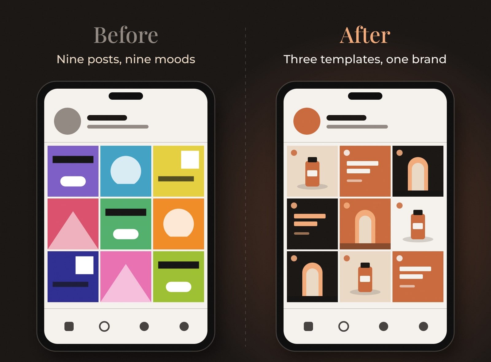
The difference on the right comes from rules, and very little talent is needed to follow them. Three templates, one brand. Whoever makes next month's posts, the grid keeps its shape.
Three tests before you post
Test 1: The thumbnail test
Look at your profile grid on a phone at arm's length.
It passes if: You can tell the three post types apart, and they still look like one company.
Test 2: The stranger test
Cover the profile name and show the grid to a friend who doesn't know the business.
It passes if: They can guess roughly what you sell.
Test 3: The language test
Scroll through your last ten posts.
It passes if: Arabic and English sit in the same places every time.
Templates belong in your brand guidelines, next to the colour values and fonts, so a new hire or a freelancer can pick them up without a two-hour briefing. If there are no guidelines yet, start there. A grid can only be as consistent as the rules behind it.
Questions people ask
How do I make my Instagram feed look consistent?
Set a few rules and use them on every post: three post templates, two main colours and an accent, one Arabic and one English typeface, one photo treatment and one place for the logo. Write them into your brand guidelines so anyone making posts follows the same ones.
Should a Gulf business post on Instagram in Arabic or English?
That depends on who you sell to, and many Gulf brands use both. Pick a lead language, keep the second one in the same position on every template, and stay consistent in captions too.
How many Instagram templates does a small business need?
In our experience three covers most small businesses: one for products or services, one for words and offers, and one for people or the place. Add another only when a real type of post keeps coming up.
Three templates. Two colours. One company.
The Brandtastic team
See Social Media Content Design
Written by Brandtastic Design Studio.