Guides · Guide
Cloud kitchen branding: how to build a brand with no shopfront
A cloud kitchen has no sign, no dining room and no smiling cashier. The brand has three places to work instead: a tiny tile in a delivery app, a bag at the door and a box on the kitchen counter.
A cloud kitchen has no sign over the door, no dining room and nobody at the counter to smile at. Cloud kitchen branding has to do all of that work in three small places: a tile in a delivery app, a bag on a doorstep and a box opened on someone's kitchen counter. Get those three right and the brand travels with every order.
Everything below is the studio's view, from the F&B identities and packaging we design. Package details near the end come from our own package pages.
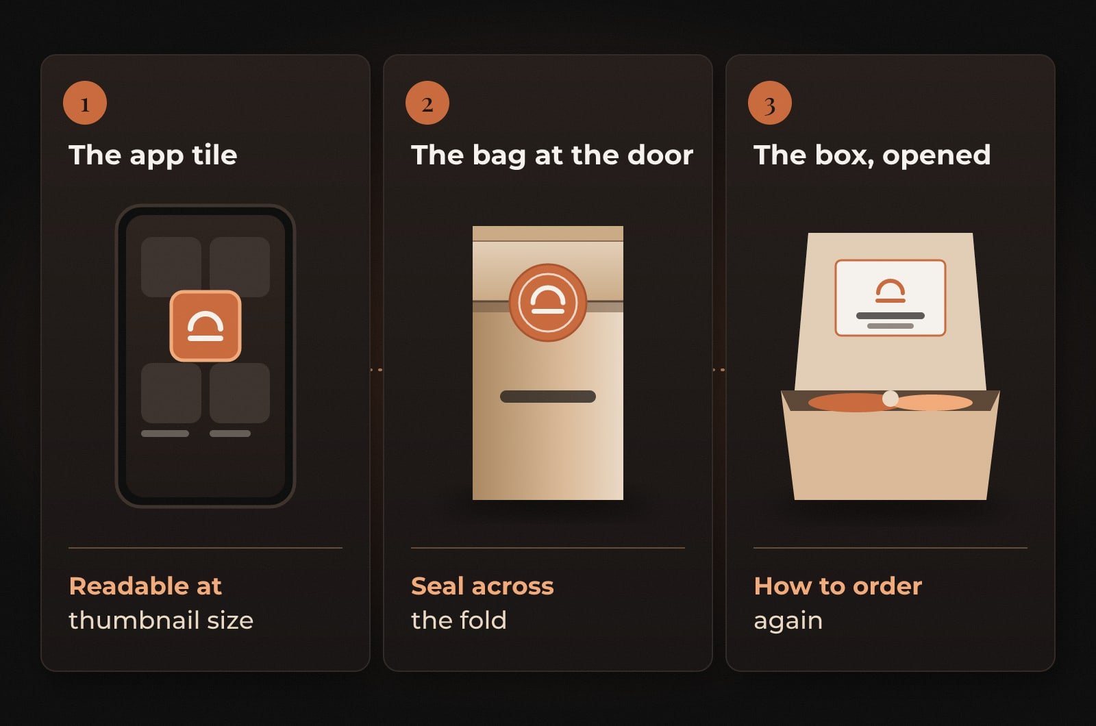
Cloud kitchen branding happens in three places
The app tile
This is your shopfront, and it is about the size of a thumbnail. A logo built from fine lines and a long name turns to mush at that size. Choose a short name, a simple mark and one strong colour, and check that it stays readable at thumbnail size on top of your cover photo. Squint at the app's listing page. If yours disappears among the others, the tile needs work before anything else does.
The bag at the door
The bag arrives first and usually gets photographed first. Put the name where the courier's hand won't cover it, and close the fold with a sticker. A seal across the fold looks deliberate, and it tells the customer the bag reached them unopened. For a small kitchen, a plain bag plus a well-designed sticker often beats an expensive printed bag.
The box, opened
Once the lid comes off, the food gets the attention and the packaging gets one more job. Tell people how to order again. A small card or a printed line inside the lid with your name as it appears in the app does more for repeat orders than another logo on the side.
One kitchen, several brands
Many cloud kitchens run more than one brand from the same kitchen, say a burger brand and a salad brand. Each one needs its own name, its own colours and its own sticker, and they should look different enough that a customer never mixes them up in the app. The costs stay sensible if the brands share plain stock packaging. Same boxes, same bags, a different sticker and seal for each brand. Your packing shelf gets simpler too.
Keep a one-page sheet for each brand on the packing station wall, with the logo, the colours and a photo of a correctly packed order. Late at night, under pressure, people copy what they can see.
Photos do the work of a shopfront
In a delivery app the food photo sits next to your logo and does most of the selling. Shoot every dish in the same light, on the same surface, from the same angle, so the menu looks like one kitchen made it. Daylight and a phone on a steady surface will do. Twenty dishes shot five different ways look like five different kitchens, and that is the opposite of a brand. Our menu design tips cover cutting the list itself, which helps here as well, since fewer dishes means fewer photos.
Three tests before launch
Test 1: The thumbnail test
Put your tile into a screenshot of the delivery app's listing page and look at it on a phone at arm's length.
It passes if: You can find yours in under a second and read the name.
Test 2: The doorstep test
Pack a real order, hand it to someone and take a photo of it the way a customer would.
It passes if: The name and the seal are both visible in the photo.
Test 3: The second order test
Ask a friend to find you again using only what came in the box.
It passes if: They find the right brand in the app on the first search.
If you are about to brief the packaging, our food packaging design checklist covers sizes, materials and what to settle before design starts.
Questions people ask
What does a cloud kitchen need for branding?
At minimum a name and logo that read clearly at thumbnail size in delivery apps, a consistent colour, a bag and a sticker to seal it, and packaging that tells customers how to order again. Consistent food photos come next.
Should each virtual brand in a cloud kitchen have its own logo?
In our view yes. Each brand needs its own name, colours and sticker so customers can tell them apart in the app. Sharing plain stock boxes and bags across the brands keeps packaging costs down.
Is a printed bag worth it for a new cloud kitchen?
Often not at the start. A plain bag closed with a well-designed sticker looks deliberate, seals the order and costs less to change if the brand evolves. Printed bags make more sense once volumes are steady.
No shopfront. A tile, a bag and a box. Make all three count.
The Brandtastic team
Written by Brandtastic Design Studio.