Branding · Myth vs fact
Colour psychology in branding: four myths worth retiring
That '90%' statistic has a history, and it isn't what the infographics say. Four colour myths we hear in briefs, and what the research shows.
Colour is one of the first things people notice about a brand, and one of the most over-explained. Every few months a new infographic announces what each colour means. Most borrow from the same small set of sources, and some borrow badly.
These are four claims we hear in briefs, next to what the evidence says.
Myth 1: 90% of buying decisions are based on colour.
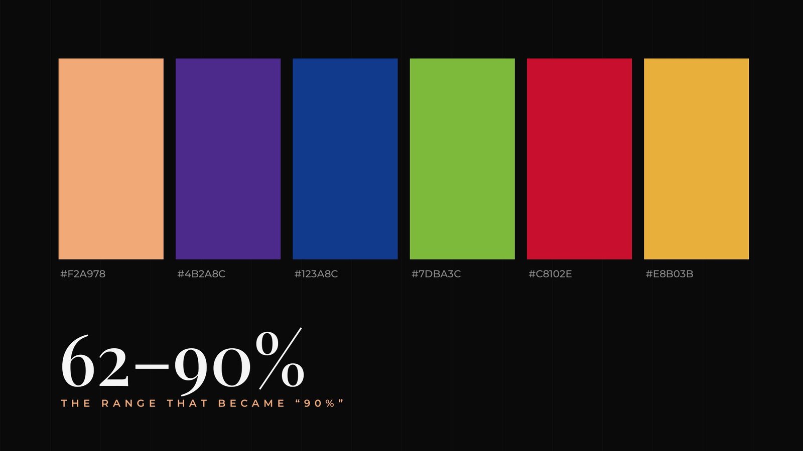
The figure usually traces back to a 2006 literature review by Satyendra Singh in Management Decision. It says people make up their minds within 90 seconds of first interacting with people or products, and that about 62 to 90 percent of that assessment is based on colour alone. A range drawn from earlier studies is a long way from a rule about every purchase.
Myth 2: Every colour has one fixed meaning.
Associations depend on culture, context and category. White signals purity in some places and mourning in others. Red means sale on a price tag and stop at a junction.
Myth 3: Blue makes people trust you.
Blue is common among banks and tech companies, so it feels familiar in those categories. Familiarity cuts both ways. If every competitor is blue, a blue brand blends in.
Myth 4: Your favourite colour should be the brand colour.
Your customers will look at it far more often than you will. The right colour suits the audience, stands apart from competitors and survives print, screens and one-colour versions.
62–90% The range in Singh's 2006 review, later rounded up to '90%'
What actually matters
- Contrast and legibility, especially for text on packaging and screens.
- Distinctiveness within your category.
- Consistency, so the exact same shades appear everywhere.
- Technical range, meaning the colour holds up in CMYK print, on screens and on cheap materials.
Treat colour research as the start of a conversation. Then test the palette where your customers will actually see it.
How we build a palette
Map the category
Collect competitors' colours and notice what everyone uses. That's the shade to avoid leading with.
Pick a lead colour
Choose one colour to carry recognition, with enough contrast for text and backgrounds.
Add support
Two or three supporting colours, plus neutrals for layouts, charts and packaging.
Test it everywhere
Check the palette in print, on screens, on kraft and coloured materials, and in one colour.
Questions people ask
Does colour really affect buying decisions?
Colour shapes first impressions, but the popular 90% figure overstates the evidence. Satyendra Singh's 2006 review reported that 62 to 90 percent of an initial product assessment can be based on colour, a range drawn from earlier studies.
How many colours should a brand have?
Most identities work well with one lead colour, one or two supporting colours and a set of neutrals. Fewer colours are easier to keep consistent.
Sources
Written by Brandtastic Design Studio.